珍珠护肤
服務項目:頂級系列、高端系列、洗護系列全案設計
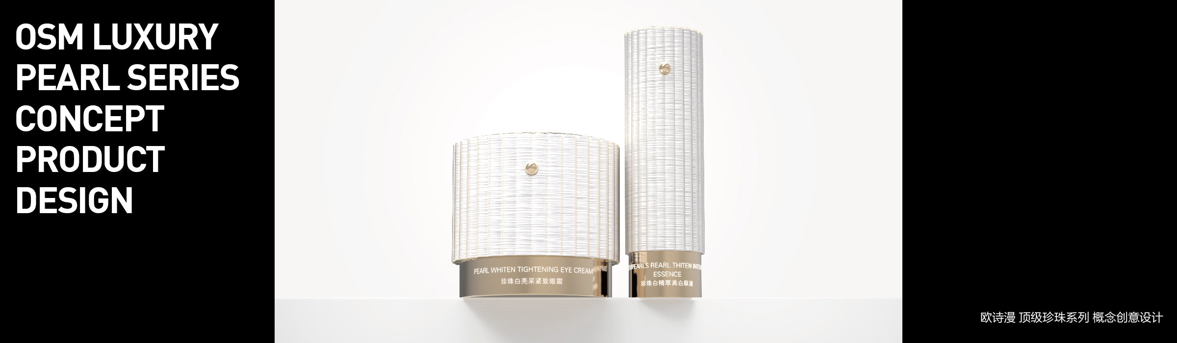
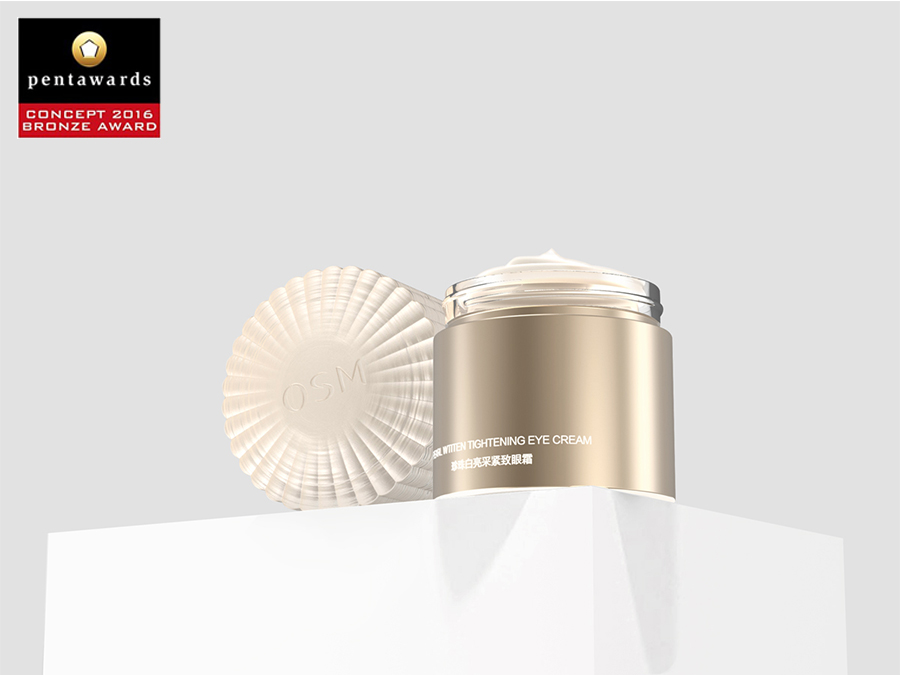
"歐詩漫"是一個以珍珠為主要成分的護膚品牌。本項目的命題是在珍珠護膚的概念下為品牌創造一套頂級系列產品的瓶型。
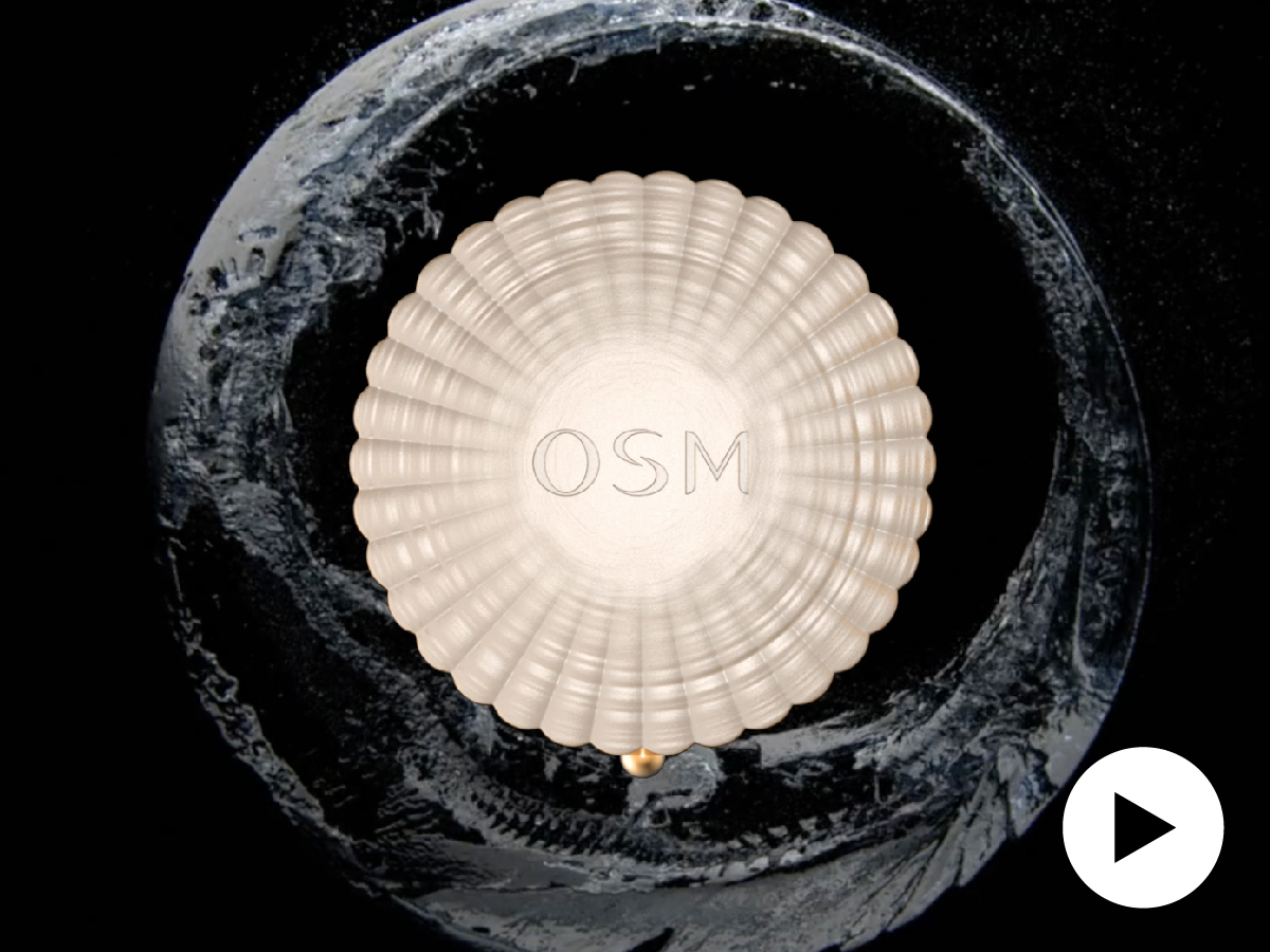
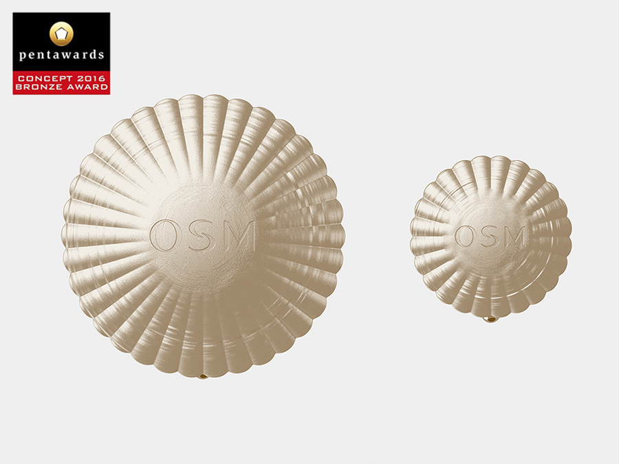
品牌一直以來都以"球形珍珠"元素作為瓶體的視覺符號,但在這個項目裡我們嘗試突破"球形珍珠"的慣性,讓珍珠重回它的"母體"——貝殼
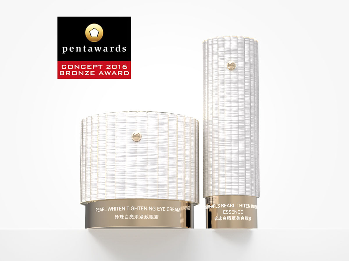
我們將瓶體的外觀處理成與真實貝殼極為相似的紋理及質感,並且把貝殼上的扇形縱向起伏這個細節重新演繹成圓柱體的形式,而且在頂視圖上呈現出一個花瓣的形態,與品牌标识相互輝映。
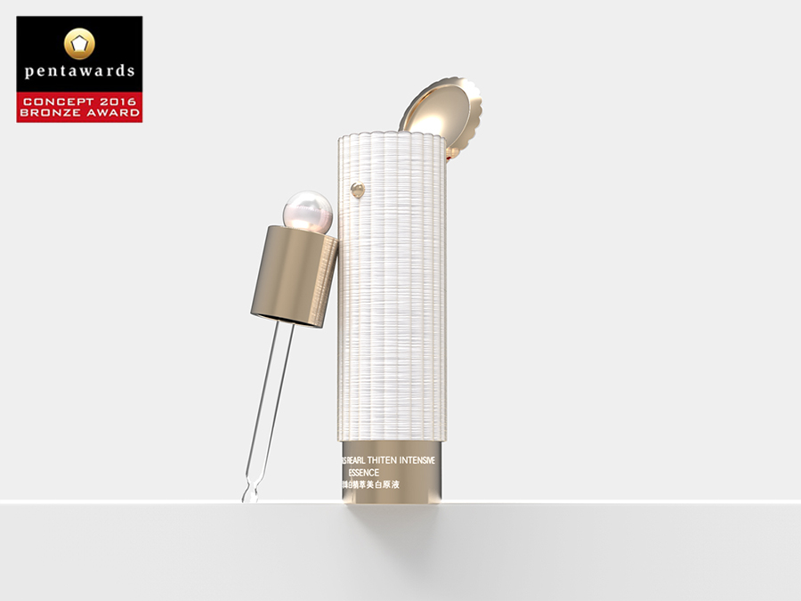
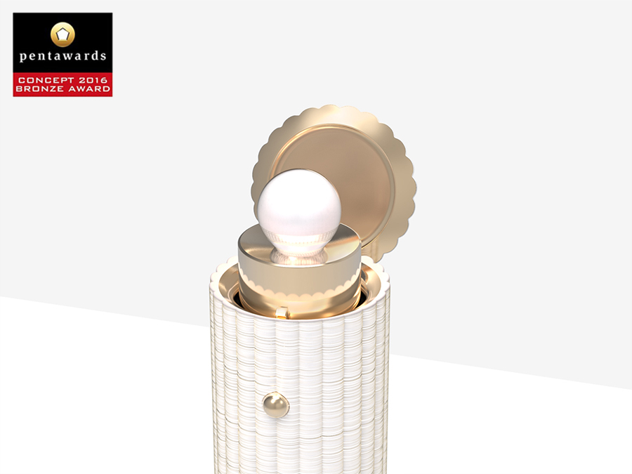
使用精華產品時,我們需要轉動瓶身底部來旋出滴灌,這個動作類似貝殼打開蓋子的一瞬間,為用戶帶來了非常生動的珍珠聯想。
OSM is a skin care brand with pearls as the main ingredients. The proposition of this project is to create product shape for a series of top brand products under the concept of pearl skin care.
OSM has been taking "spherical pearl" as the visual symbol of the products, however in this project we attempt to break through the inertia of "spherical pearl" and let pearl go back to its matrix - shells.
We process the appearance of the product into extremely similar texture with real shells, and rework the fan-shaped longitudinal waves into the form of a cylinder, and presents a petal shape in the top view, which is merged with brand logo.
While using essence products, we need to screw the product bottom to spin out the drip irrigation emitter. This motion is similar that you open the lid of the shell, which associates real vivid pearl.