coscure 新品牌塑造
COSCURE 自在肌の方程式
— 追寻肌肤本质之美
日本美学尊崇“少即是多”的极简主义
少是精简而非空白
多是完美而非拥挤
即摒弃不必要的元素
以呈现事物的本质之美
日本女性的护肤哲学也深受该理念的影响
她们追求极致的纯粹与天然
用最科学也最系统的方式
以繁化简 提炼最有效的成分
还原肌肤的原生质美
原生肌肤的状态在于年轻和不加修饰的自然感
是完全放空的自在感
是少女般的清透 白皙 纯洁与活力
像跳跃的音符或流动的香气
毫无杂志和负担
解锁原生肌肤如同解开一个繁复的方程式
我们借由日本美学少即是多的极简理念
和医院美肤严谨系统的科学标准
将细胞依序而列
让新生以此而来
由此破解自在肌的方程式
就是追寻肌肤本质之美最直接的法则
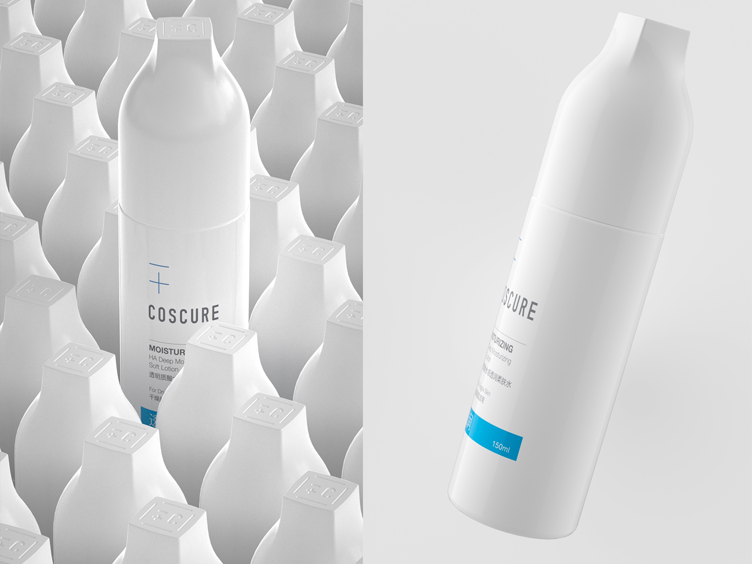
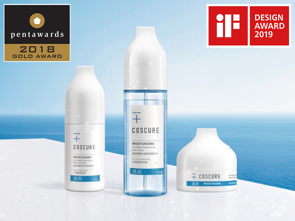
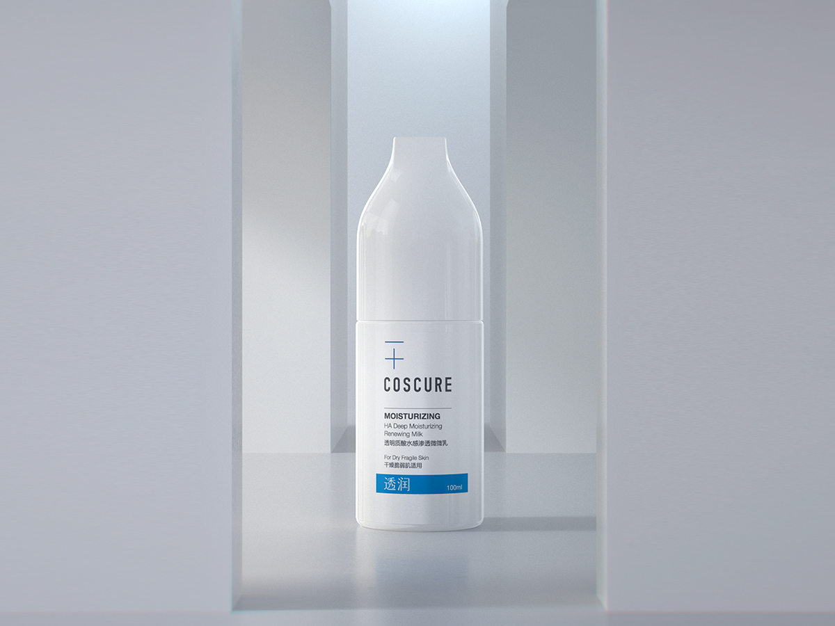
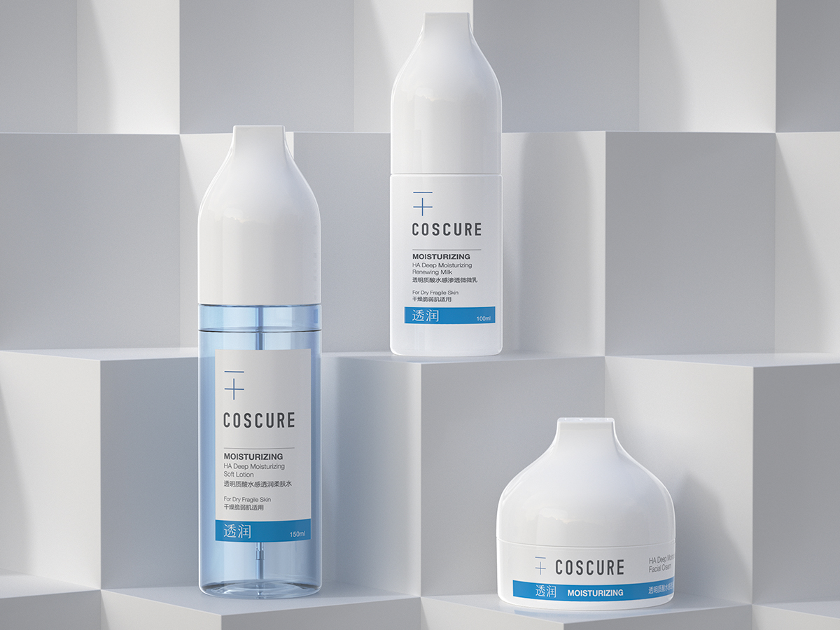
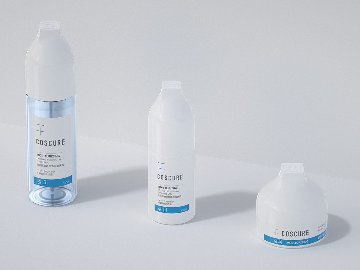
COSCURE 是一个面向年轻一代消费者的药妆品牌,品牌倡导 - 更少成分, + 更大功效平衡护肤理念,因此我们创造了品牌ICON ±C。简单、不添加、克制、纯粹,是Coscure的品牌关键词。
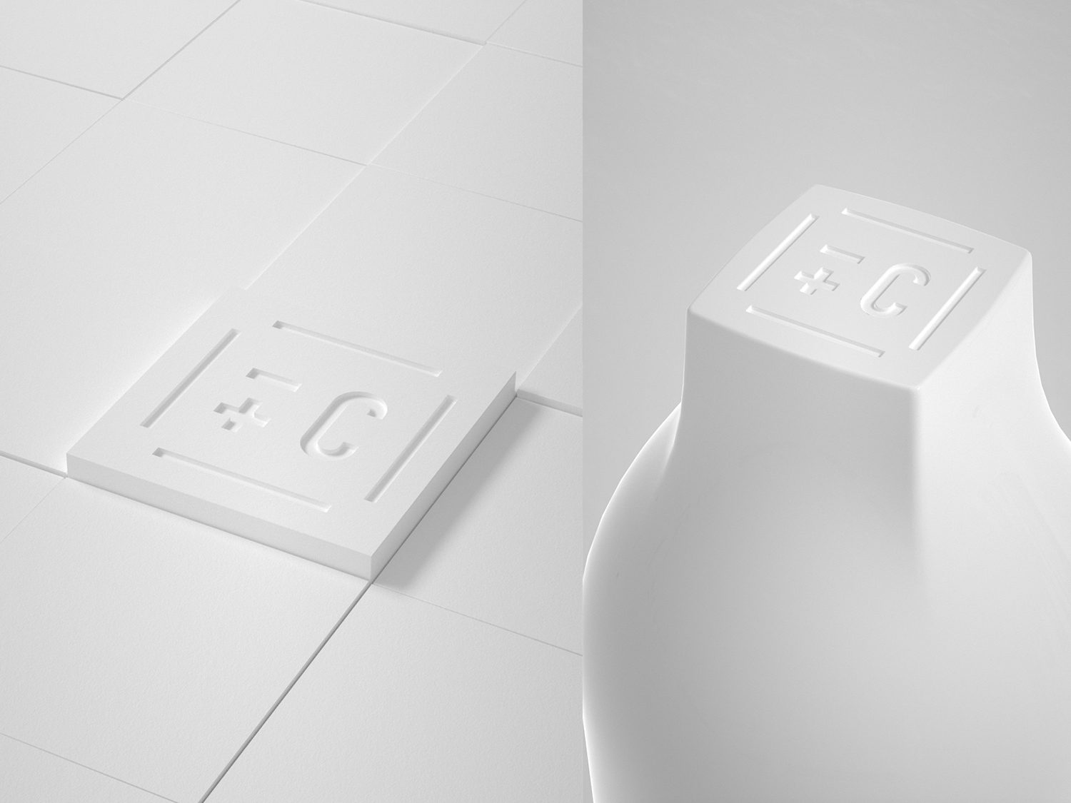
关于“护肤之美和护肤之功效”,多与少、繁杂与克制,是永恒的平衡主题。我们在一个极为符号化的瓶体上,只在盖子顶部做了一点点变化:一个正方向的顶面。
这个方形象征着 ± C 的品牌理念:用理性、克制的态度创造产品。同时,方形表格也来自“化学元素周期表”,在体现严谨的实验室气质的同时,也是一个可以无限延展的平面视觉元素。
COSCURE is a cosmeceut ical brand for younger consumers, it advocates - cos & + cure balance skin care idea. So we created the brand ICON ± C. Simple, No additive, Restrain, Pure are the brand keywords of Coscure.
About The beauty of skin care and the effect of skin care , more and less, complexity and restraint, is the eternal balance theme. We made a little change on the top of the cover on a very symbolic bottle: a squared top.
This square symbolizes the ± C brand’s idea: creating products with a rational and restrained attitude. At the same time, the square table also comes from the periodic table of chemical elements , which embodies the rigorous laboratory temperament, but also an infinite extension of the plane visual element.